Objective & Vision
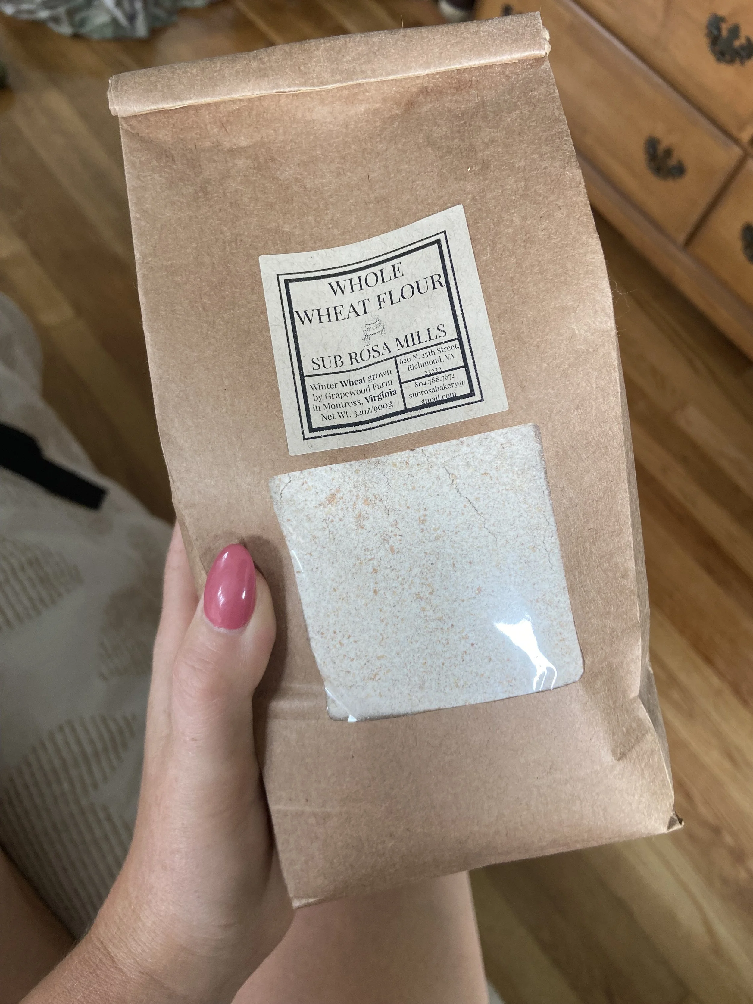
This project was all about bringing Sub Rosa’s soul to life through packaging—capturing their timeless craft, human touch, and love for fresh, whole ingredients. The goal? To transform their flour line into something that truly reflects the excellence and care they put into every product, making it as beautiful and thoughtful as the Richmond-based bakery itself.
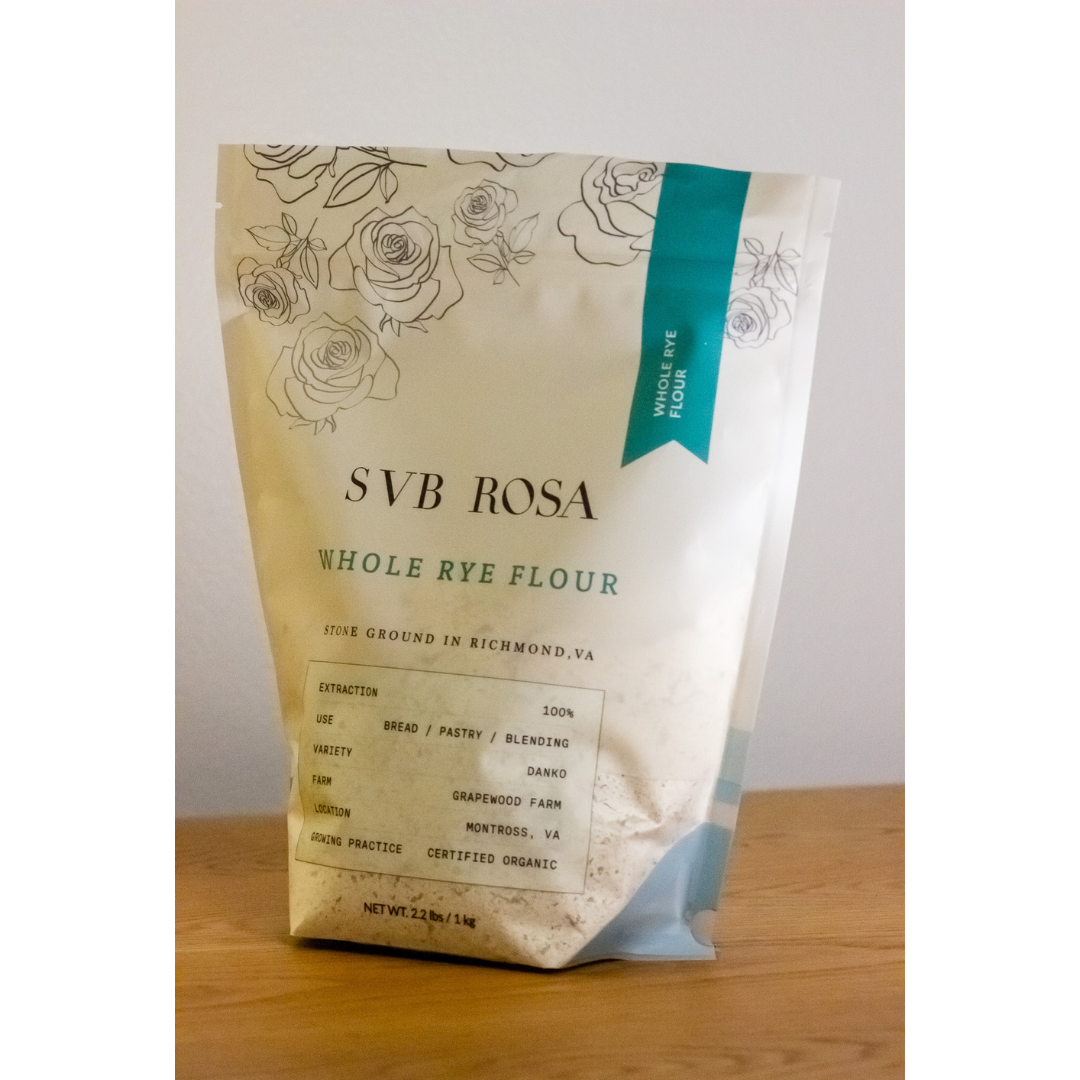
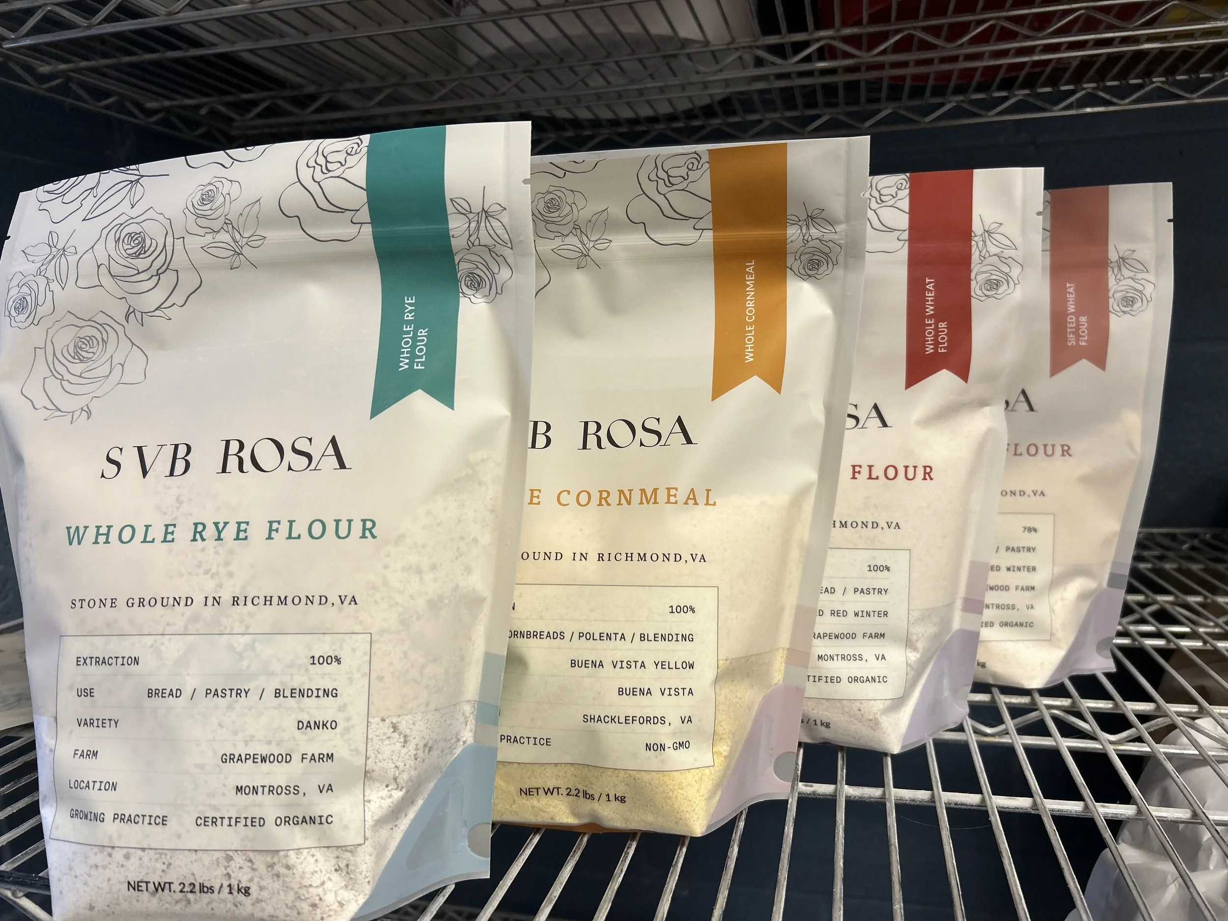
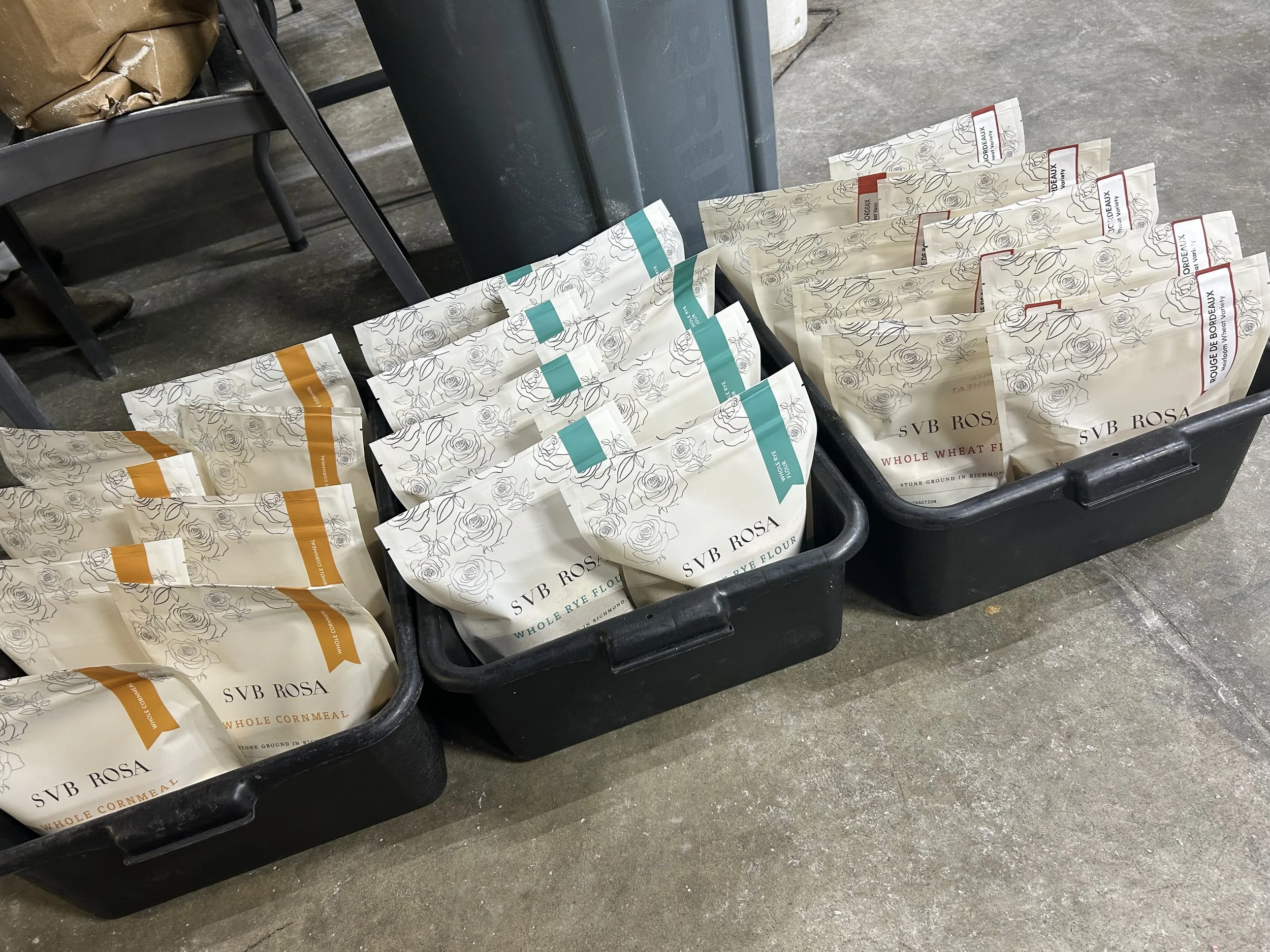
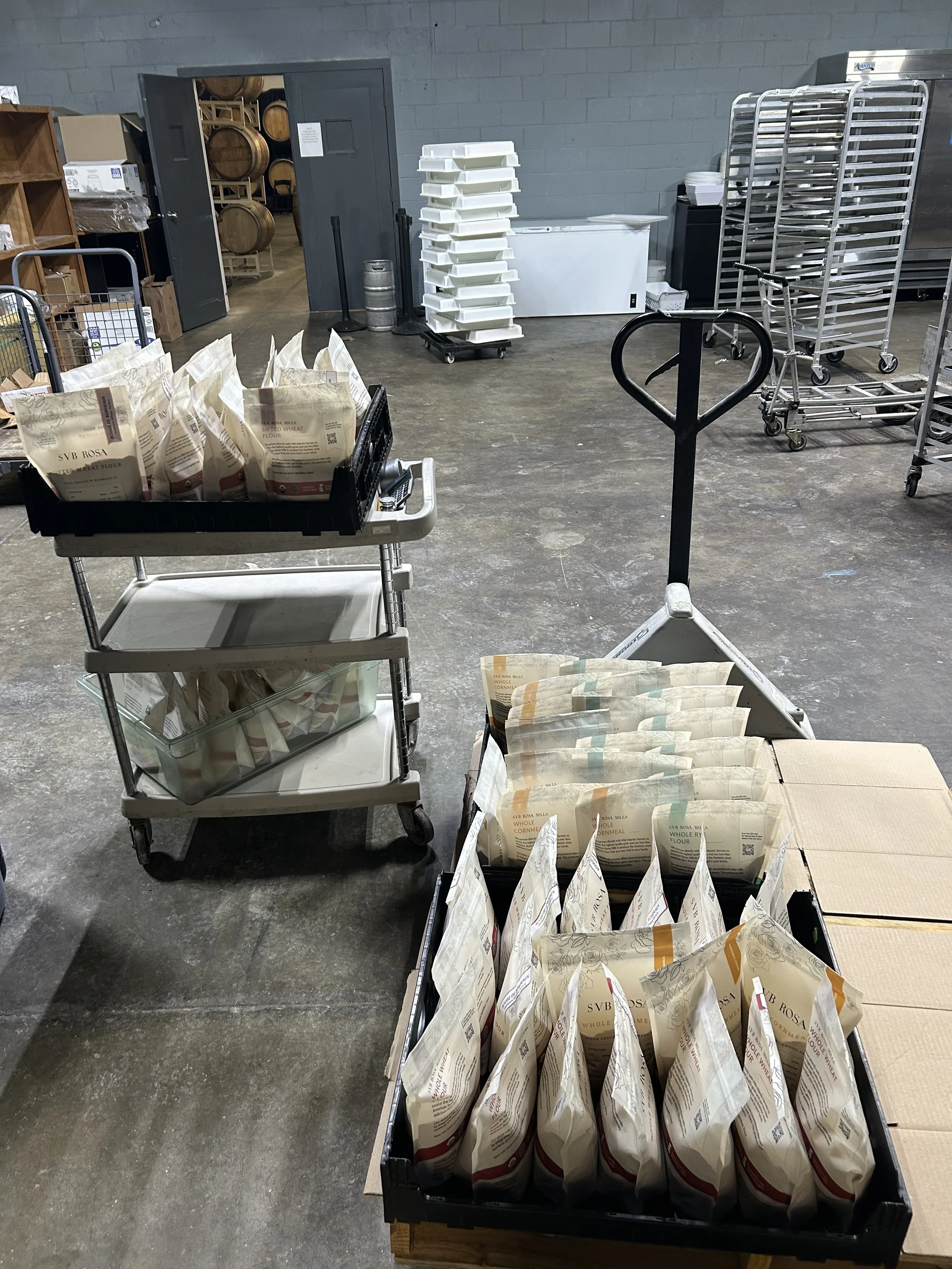
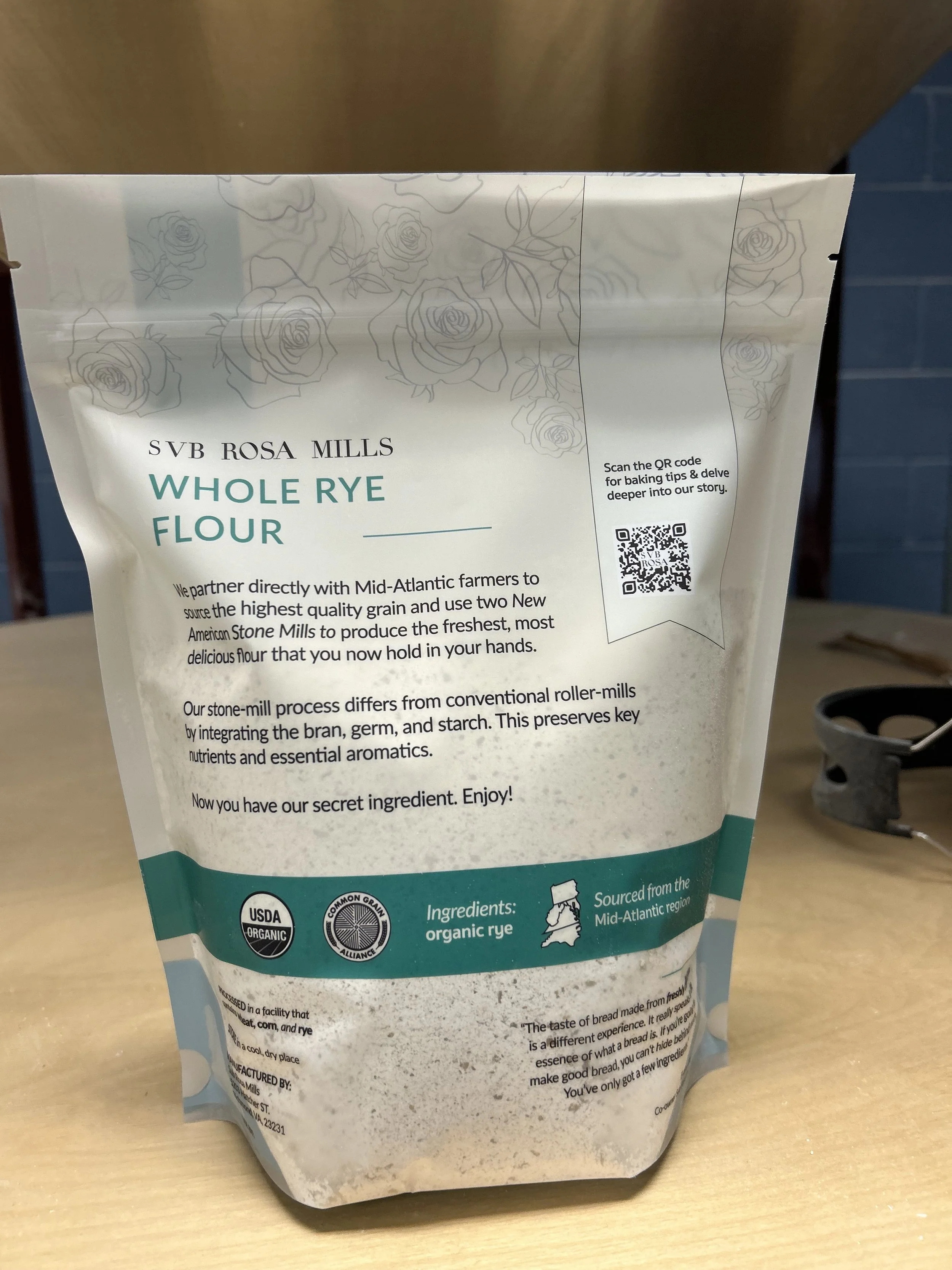
Working closely with Sub Rosa’s founders, Evrim and Evin, we reimagined the packaging for their expanded line—Whole Wheat, Sifted Wheat, Whole Rye, and Whole Cornmeal. The design blends elegant, graceful rose illustrations with solid, typewriter-inspired typography, clean earthy accents, and scientific spec labels. The result: packaging that feels modern yet grounded, approachable yet aspirational, inviting both loyal customers and curious newcomers to connect with this local treasure.
This redesign isn’t just about aesthetics; it’s about creating something that feels as authentic and thoughtfully crafted as Sub Rosa’s products—a love letter to Richmond’s bakers and beyond.
Challenges
This project presented a few key challenges: striking the perfect balance between an intricate design that reflected Sub Rosa’s artisanal roots and a clean, modern look that felt approachable and functional. Another hurdle was modernizing their existing logo for better scalability while preserving its charm and timeless appeal.
We also needed to create packaging that clearly distinguished the four flour varieties—Whole Wheat, Sifted Wheat, Whole Rye, and Whole Cornmeal—while maintaining a cohesive brand identity. The ultimate goal was to honor Sub Rosa’s authentic, handcrafted essence while ensuring the packaging was as clear, usable, and thoughtfully crafted as the products themselves.
Understanding the Foundation
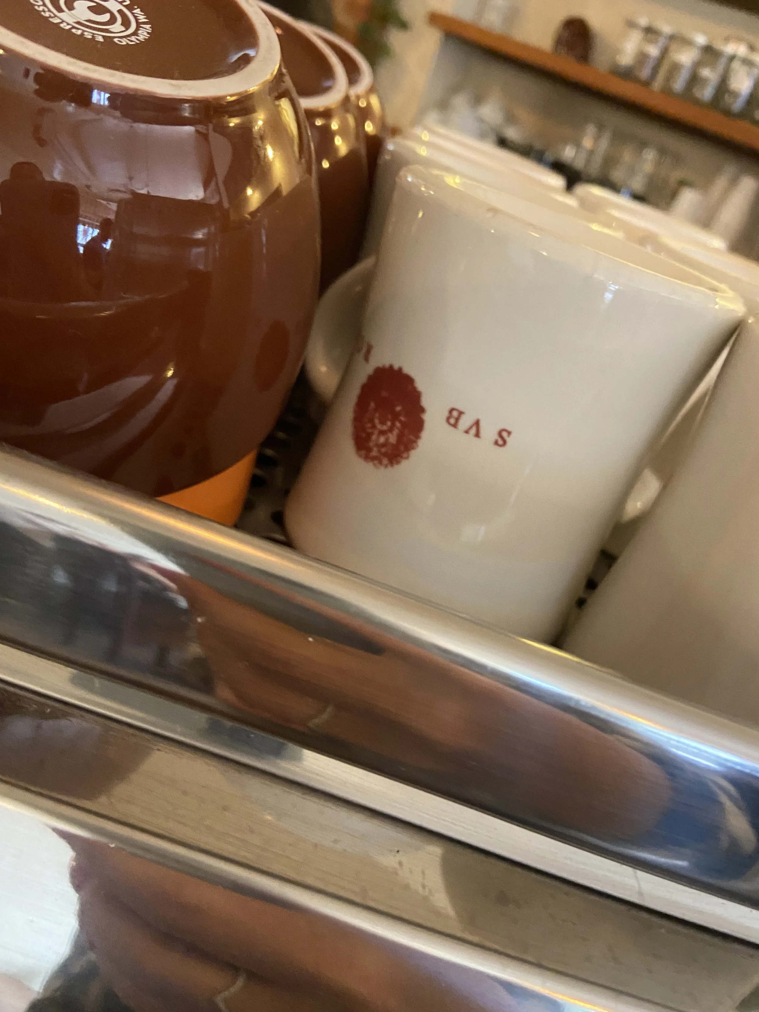
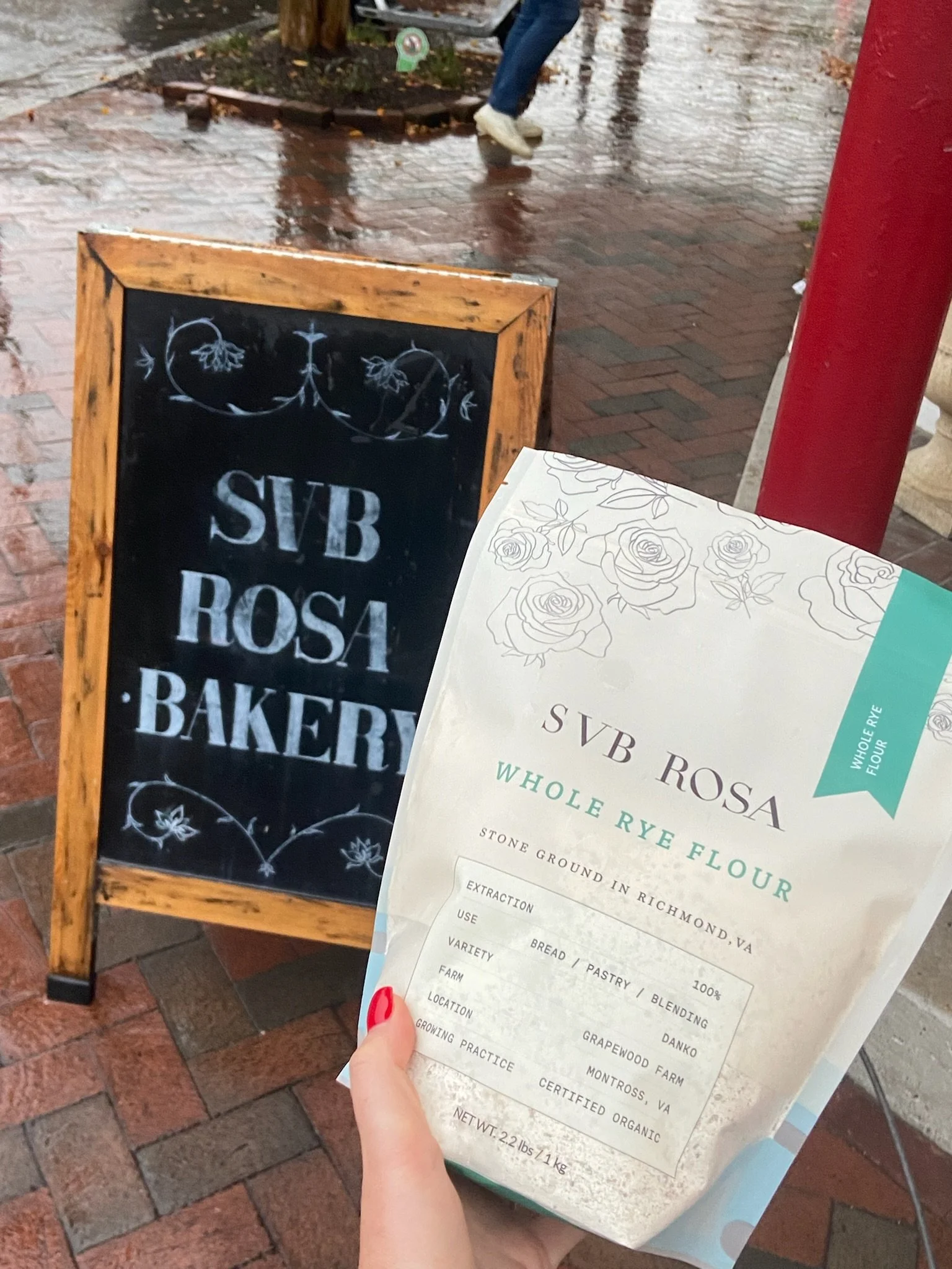
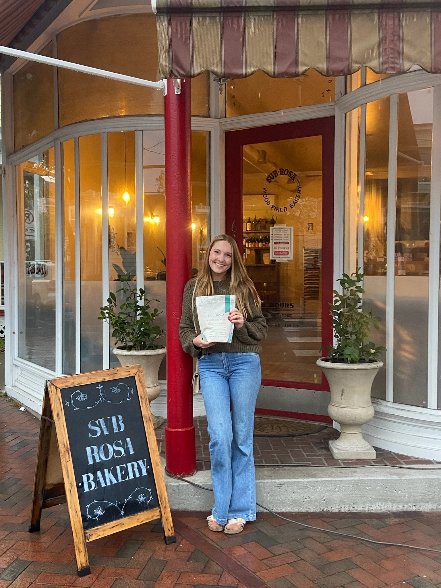
The project began with an in-depth exploration of Sub Rosa’s identity. I carefully examined their existing packaging, logo, and branding elements, while also immersing myself in their bakery’s space and story. This hands-on approach gave me a deeper understanding of their vision, their values, and the unique character of their thoughtfully crafted products.
Experiencing the Mill First-Hand
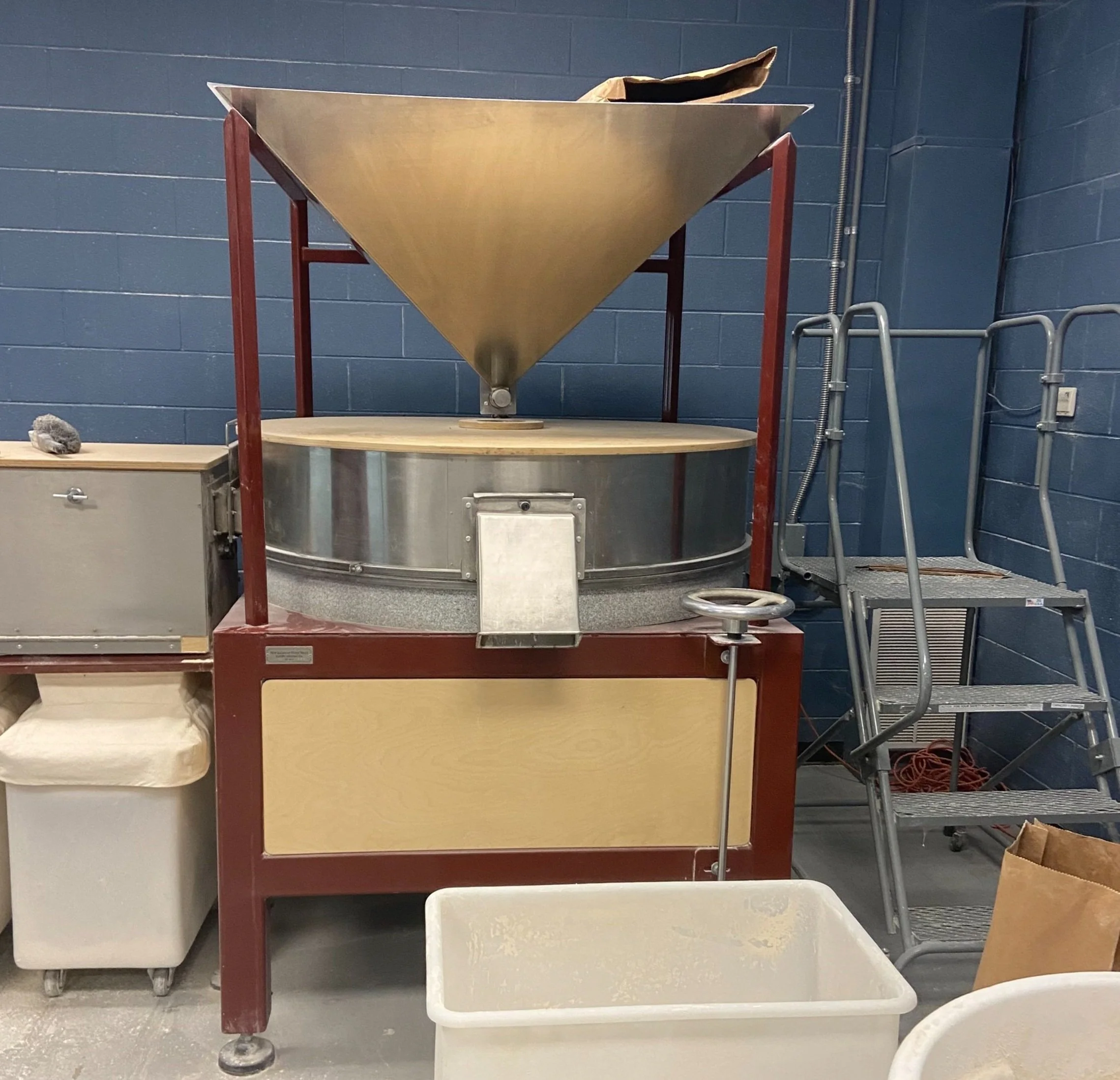
To truly capture the essence of Sub Rosa’s flour and the artisanal process behind it, I had the privilege of visiting their mill. This immersive experience deepened my appreciation for the craft and care that go into every product. Witnessing the milling process firsthand and discussing the vision with the owner brought invaluable insights, enriching my understanding and ensuring the final design authentically reflected Sub Rosa’s story.
Research & Exploration
Before diving into design iterations, I took time to thoroughly explore where we wanted to take Sub Rosa’s brand identity and packaging essence. This included working in black and white to focus on structural and typographic elements, experimenting with illustrations and patterns, and developing ideas for incorporation into the final designs.
As part of this process, I conducted market research, comparing packaging from other brands to analyze layout proportionality, balance, and visual impact. This exploration ensured that every design choice not only aligned with Sub Rosa’s ethos but also stood out on retail shelves while feeling cohesive and inviting.
Logo Re-design
The logo redesign focused on preserving Sub Rosa’s cherished artisanal identity while modernizing it for broader applications. With multiple existing logos, we needed a unified version that was versatile enough for scalable formats across packaging, digital media, and print. Recreating the logo in Adobe Illustrator ensured it was clean, adaptable, and ready for any use, while maintaining its original charm and warmth.
Iterative Design
The packaging design evolved through several rounds of iteration, each one refining and enhancing the vision for Sub Rosa’s expanded flour varieties. Collaboration and adaptability were at the heart of this process, ensuring that each design choice aligned with the brand’s identity while addressing both creative and practical needs.
As we neared completion, I maintained ongoing communication with Sub Rosa’s team and the printing vendor. This ensured that each design iteration not only met the brand’s vision but was also optimized for production, scalability, and the technical requirements of the print process.
Round 1: Exploring Directions
In the initial phase, I presented a variety of concepts to establish a visual direction. These designs explored different typographic styles, illustrative elements, and layouts to find the balance between modern simplicity and the artisanal, handcrafted feel central to Sub Rosa’s identity.
Round 2: Refining the Vision
Based on feedback from Sub Rosa’s team, I refined the selected concepts, focusing on clarity, cohesion, and storytelling. This phase involved honing the typography choices, introducing hand-drawn rose illustrations, and experimenting with the earthy color palette to ensure it resonated with the brand’s values.


Round 3: Perfecting the Details
The final phase concentrated on fine-tuning the designs to ensure they were not only visually stunning but also functional and adaptable for future use. I standardized the layout for specification labels, adjusted color accents for product differentiation, and ensured the designs met all printing specifications. Every detail—from opacity overlays to line weights—was meticulously reviewed to achieve the desired depth and balance.
The Final Product
We’re thrilled with the outcome of this project. The new packaging brings Sub Rosa’s artisanal spirit to life in a fresh, modern way with vibrant colors and textures that stand out on shelves. It’s been great to receive such positive feedback from both the team and their customers.
The redesign has already made a big impact, driving demand and reorders. Sub Rosa is expanding its flour selection, showing how successful the new packaging has been in strengthening their connection with loyal customers.
“Grace helped with every part of the process from content, design, to product packaging. Her excellent communication, thorough attention to detail, and most importantly her ability to translate ideas into a beautiful reality made all the difference. Cannot recommend highly enough.”
–– Evrim Dogu, Co-owner of Sub Rosa
I’m so proud to have worked on this project and can’t wait to help more brands like Sub Rosa bring their vision to life. If you’re looking to elevate your brand and connect with your audience through design, let’s chat. Whether it’s packaging, branding, or anything creative, I’m here to help make it happen.


